Hi folks
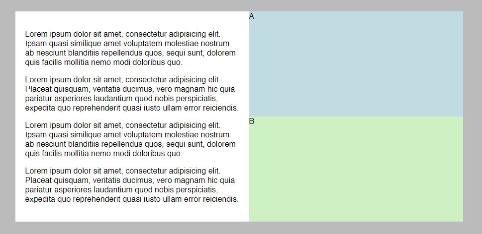
Let's try to make something like this in flexbox.....it is really simple.....honestly I wanted to store this design somewhere for later usage and at the same time I wanted to share it with you wonderful people.
It is not a standard flexbox. This one is LEFT / RIGHT and RIGHT divides into A / B...the trick is in the flex-direction:column; in your CSS file
We will next all the divs inside the container div.
But right div will have also two children divs....so let's get to it.
This is our HTML
<div class="container"><div class="leftcolumn"><p>Seoandwebdesign is a Los Angeles based company that specializes in webdesign, marketing, retouching and much more...</p><p>Seoandwebdesign is a Los Angeles based company that specializes in webdesign, marketing, retouching and much more...</p><p>Seoandwebdesign is a Los Angeles based company that specializes in webdesign, marketing, retouching and much more...</p><p>Seoandwebdesign is a Los Angeles based company that specializes in webdesign, marketing, retouching and much more...</p></div><div class="rightcolumn"><div class="rightcolumn-a">A</div><div class="rightcolumn-b">B</div></div></div>
.container {max-width: 900px;margin: 0 auto;display: flex;}.leftcolumn {background-color: #eee;font: white;padding: 20px;flex: 1;}.rightcolumn {background-color: yellow;flex: 1;display: flex;flex-direction: column;}.rightcolumn-a {background-color: #c0dbe2;flex: 1;}.rightcolumn-b {background-color: #cdf1c3;flex: 1;
And here is the codepen https://codepen.io/anon/pen/VQdear Looks amazing doesn't it?
Basically what we have here is one main parent div inside which are two children divs.....left and right column. Parent div has a display: flex; selector and child divs have flex:1; selector, so they both have the same width size.
But the right child div acts also as a parent div to another two child divs....so we append display: flex; to child div and flex:1; to each grandchild div.....
simple as cake.....
Add new comment