FLEXBOX BASICS
Flexbox is wonderful. It is very similar to CSS grid, but do not mix them together. They are different css systems.
Let's look at Flexbox first. I am just learning it and people praise it.
It is used by simply adding this code to a parent div
display: flex;
For example, we have a div named container, that contains three divs. We will try to make a three column design.
So it goes like this
container
box1
box2
box3
So we set container with css
.container {display: flex;}
and each box gets
.box {flex: 1;}
If all boxes have flex: 1; they will have the same width.
.box 1 {
flex: 1;}.box 2 {flex: 1;}.box 3 {flex: 1;}
If we want box 1 to be double size as box 2 and 3, we set box 1 with flex:2, and box 2 and 3 with flex: 1,
.box 1 {
flex: 2;}.box 2 {flex: 1;}.box 3 {flex: 1;}
simple, easy peasy
FLEXBOX ORDER
We can set the order for each div inside the main container, in our case we use the box.
If we want to display box 2 before box 1 we just use order command
.box 1 {
flex: 2;
order: 2;
}.box 2 {flex: 1;
order: 1;}.box 3 {flex: 1;
order: 3;}
FLEXBOX AND MARGINS BETWEEN COLUMNS
Let's say we want to have a little bit of space between each box inside the container div.
Our code would look like this
<div class="container">
<div class="box"> fox </div>
<div class="box"> dog </div>
<div class="box"> camel </div>
</div>
With regular CSS we would use margin-right: 50 px; for example. NOT IN FLEXBOX ...yeahhhhh
Even with margin-right we would be left with the awful gap at the right part of the container....well flexbox fixes this...
We just use flex-basis:30%; for example, to set each column box with 30 % width and we are left with 10% extra space......
And for container we should use justify-content: space-between;
FLEXBOX RESPONSIVE FOR MOBILE
In this case, the best is to disregard flex and justify-content: space-between;
We can use media query...
@media (min-width: 900px;)
.container {
display: flex;
justify-content: space-between;
}
In this case, flexbox only works in case we have a device with the width of the screen larger than 900px. If the screen is smaller, then the boxes with stack on top of each other and not stay in line. Remember small screen have no space to show all three boxes with content in one line /row, they need to be stacker so we get three lines..
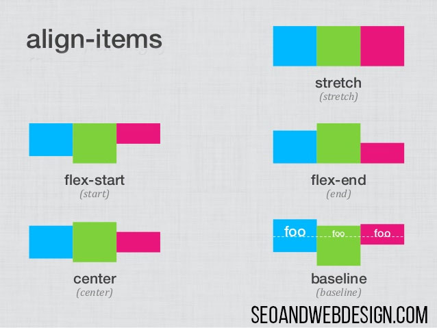
FLEXBOX AND COLUMN HEIGHT
Normally each column inside the main container has the same height.
But we can play a bit with that. If we do not want the same height we can use these commands in CSS
align-items: flex-start; where they align at the top of the columns
align-items: flex-end; where they align at the bottom of the columns
align-items: center; where they align at the center of the columns
we can also use stretch (default value) and baseline command
FLEXBOX AND FLEX WRAP
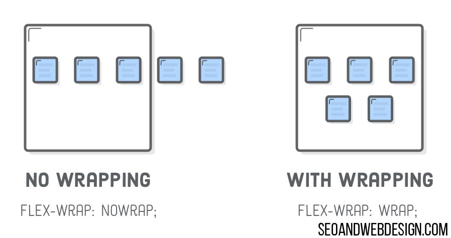
Another problem would be if we have like 5 divs inside the container where each is let's say 150 px wide. When we decrease the size of the screen, flexbox keeps all 5 divs in the same line, it also removes the space between them. If we want to display 5 divs in several rows, so they are not crumbled together in 1 row, we use command flex-wrap: wrap; So here is the code for example for 5 divs with static 150 px width...that does not squeeze inside one row if the screen size gets too small...
<div class="container"><div class="box-fixed-size">1</div><div class="box-fixed-size">2</div><div class="box-fixed-size">3</div><div class="box-fixed-size">4</div><div class="box-fixed-size">5</div></div>.container {display: flex;align-items: center;justify-content: space-around;flex-wrap: wrap;}.box-fixed-size {width: 150px;height: 100px;line-height: 100px;text-align: center;margin-bottom: 20px;background: red;}And codepen example is here https://codepen.io/anon/pen/QQxjVZCodepen without wrap is here https://codepen.io/anon/pen/mXKezB try to resize the screen
FLEXBOX AND CENTERING TEXT HORIZONTALLY AND VERTICALLY
Let's try to center a piece of content inside the div...We use command margin: auto; ..... We can all remember when we used margin: 0 auto; before flexbox, so now we use just auto. It became really simple to center content with flexbox.
<div class="container"><div class="centertext">Seoandwebdesign.com is the best</div></div>.container {height: 400px;max-width: 700px;margin: 40px auto;background-color: red;display: flex;}.centertext {color: #FFF;font-size: 20px;margin: auto;}And here is codepen for this example https://codepen.io/anon/pen/WMyQMK
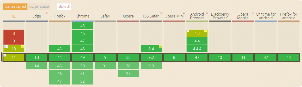
FLEXBOX AND BROWSER COMPATIBILITY
Well, pretty much all browsers are compatible with flexbox, at least latest versions. Only the IE 11 is still a problem. But who is still using that outdated browser anyways? And every person that is on the internet, must update their browsers at regular intervals...We can definitely start using this beautiful design.
Add new comment